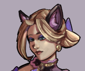
 Drawing over allowed <3 PLEASE HELP
I LOVE ART. I LOVE MAKING ART. I LOVE PEOPLE WHO MAKE ART!
She/Her
stay at home artist
Joined on 10/14/24
- Level:
- 2
- Exp Points:
- 36 / 50
- Exp Rank:
- > 100,000
- Vote Power:
- 2.44 votes
- Rank:
- Civilian
- Global Rank:
- > 100,000
- Blams:
- 0
- Saves:
- 0
- B/P Bonus:
- 0%
- Whistle:
- Normal
madsmars
i think you just have a few connection and proportion problems that should be easy to fix! 1) the area between the characters eyes and nose doesn't feel like it has enough space - i would widen the distance between the eyes a bit! 2) the narrowing of the cheek into the chin seems to be very stylized (which is totally fine) but anatomically speaking their mouth would need a little bit more space so maybe dropping the cheek to allow room for the oral cavity would make it feel more anatomically correct. and lastly 3) the neck seems to be attached to the middle of the head whereas anatomically speaking it would be connected to the back of the skill - think spinal column connection. I think shifting where the head rests on the neck will change a LOT. (i hope this was helpful (*ノωノ) beautiful job rendering btw!)
CommanderKat
Thank you so much <3